




Priddy MKTG

JCatch – Modern Matchmaking with Meaning

How We Helped JCatch Build a Brand That Bridges
Jewish Tradition with a Modern Experience

cache catch logotype logo design catching czech cash clothing brand ochre catches letterhead online merchant behance hatch calligraphic catcher coach larch touch clutch bag
apple music icon twine fuchsia tangle music note treble clef tendril apple music social icon musical note pink background paperclip music notes squiggle music player extension cord paper clip tied knot line icon earbuds ribbon

Problem

JCatch needed a refined brand identity and digital presence that resonated with today’s Jewish singles—modern, approachable, and grounded in tradition. With no formal website and a fragmented online presence, they lacked a cohesive platform to showcase their services or build trust at scale.

etsy social icon etsy icon dribbble social icon rss social icon blogger social icon behance social icon soundcloud social icon line social icon amazon social icon social media icon energy efficient lightbulb dribbble icon information symbol conceptual symbol line icon bulb facebook social icon xing social icon linkedin social icon digital creative agency

Idea

Reimagine the brand to reflect the warmth and depth of Jewish values while appealing to a modern audience seeking meaningful relationships. Create a seamless, welcoming experience for all users—whether a potential client, candidate, or someone referring a friend.

paper plane bandcamp social icon envelope wavelength dotted arrow adhesive note bandcamp icon twitch icon padded envelope twitch social icon paper boat envelopes drizzle soundcloud icon postmark forward arrow paper crane crumple flaking warning triangle

Solution

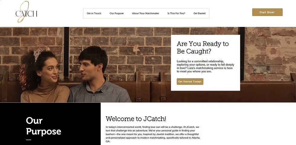
We delivered a new logo, messaging, and a sleek, user-friendly website to elevate JCatch’s credibility and engagement.

About The Project

JCatch came to us with a clear goal: to elevate their matchmaking brand in a way that felt contemporary yet deeply rooted in Jewish values. As a personalized matchmaking service, JCatch needed to connect emotionally with a modern audience while preserving the care, tradition, and cultural integrity that set them apart.
 

We started by digging into their mission creating meaningful, purposeful connections. From there, our goal was to build a brand and website that felt authentic, trustworthy, and modern enough to appeal to today’s singles who are serious about finding love.

Key Project Points We Focused On

Brand Identity & Visual System

  • Designed a minimalist, symbolic logo that captures the heart of personalized matchmaking

  • Introduced an emotionally resonant color palette and modern typography for digital and print use
     

Website Design & UX Strategy

  • Developed a clean, mobile-optimized website with intuitive navigation

  • Structured user journeys for Clients, Candidates, and Referrers, each with its own call-to action

  • Integrated Google Forms to streamline sign-ups and route leads directly to the matchmaker
     

Messaging & Copywriting

  • Crafted high-trust, warm copy that honors Jewish culture while appealing to modern relationship seekers

  • Balanced clarity and emotion to reflect JCatch’s personal, thoughtful approach

Our Solutions

JCatch now has a powerful, cohesive brand and a digital presence to match. The new site not only elevates their credibility but also increases engagement and form completions. Visitors can quickly understand what JCatch offers and how to get started.

Impact at a Glance

  • Clearer brand story with strong emotional resonance

  • Higher engagement rates and lead conversions via the website

  • Consistent positive feedback from users and clients

 
Website: J-catch

Before & After Highlights

Slide
imgi 4 1

Logo Design

Before: No cohesive brand mark or professional identity
After: Clean, modern logo reflecting thoughtful matchmaking and Jewish heritage
previous arrow
next arrow

imgi 25 default      Anna the lifesaver! I was already running my business but I put the cart way before the horse and got super ahead of myself. Anna let me work and soar while getting down to the core of my vision and taking action for organizing my work, helping me run more efficiently and having all of it come to life. She will make you a well-oiled machine and explain it in laman terms (if you’re anything like me and you don’t even know what you need or where to start). And if you only need her for something small, good for you but still, she’s your gal because she makes it all so easy! Thank you, Anna! I am so lucky to have found your services to use each month as I grow! imgi 25 default

– Lara Wachtler

Let's Connect

Let’s Collaborate and Build Your Business Together

Ready to take your business to the next level? Let’s create a plan that sets you apart and drives your success.

ribbon breast cancer awareness treble clef breast cancer dribbble ampersand signature pink background ribbon banner cursive dribbble icon calligraph ribbons musical note musical symbol tied knot pink colour dribbble social icon hairpin pink color