


Priddy MKTG

Wildflower and rose

Shopify Website Redesign, Branding & E-Commerce Optimization

apple music icon twine fuchsia tangle music note treble clef tendril apple music social icon musical note pink background paperclip music notes squiggle music player extension cord paper clip tied knot line icon earbuds ribbon

Problem

The client’s Shopify website had grown difficult to navigate, making it hard for customers to find products and leading to low sales and weak brand visibility.

etsy social icon etsy icon dribbble social icon rss social icon blogger social icon behance social icon soundcloud social icon line social icon amazon social icon social media icon energy efficient lightbulb dribbble icon information symbol conceptual symbol line icon bulb facebook social icon xing social icon linkedin social icon digital creative agency

Idea

Strip away the clutter, clarify the brand, and rebuild the website around simplicity, usability, and conversion.

paper plane bandcamp social icon envelope wavelength dotted arrow adhesive note bandcamp icon twitch icon padded envelope twitch social icon paper boat envelopes drizzle soundcloud icon postmark forward arrow paper crane crumple flaking warning triangle

Solution

We created a new logo and brand identity, redesigned the Shopify site, and rebuilt the shopping experience with clearer navigation, product filtering, SEO optimization, and a mobile-first checkout flow.

About The Project

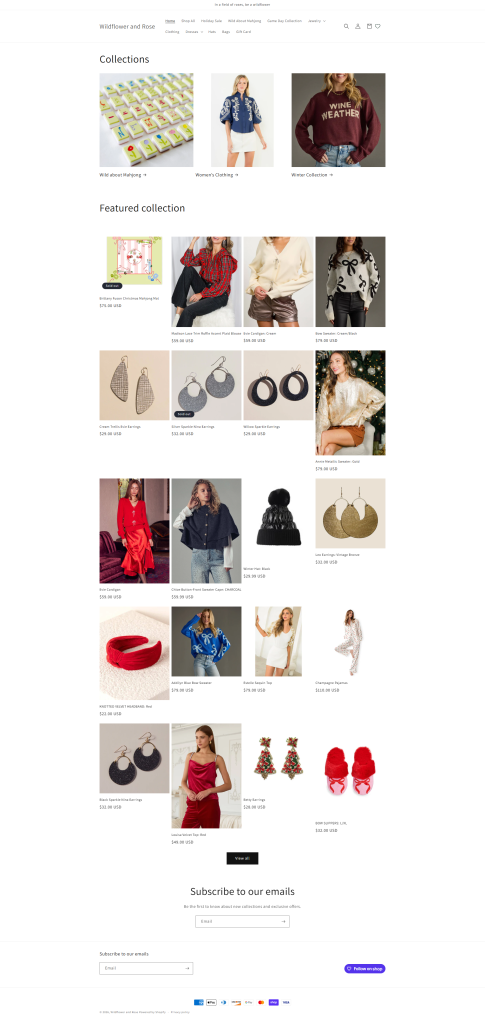
When this client came to us, they had a great product line but a website that simply wasn’t doing it justice. Their Shopify store started as a template and had grown piece by piece over time. As more products were added, the site became harder to navigate, categories became confusing, and customers struggled to find what they were looking for.
 
The result was a site that existed, but didn’t perform.
We started with a discovery call to understand the brand, the audience, and where things were breaking down. It quickly became clear that this wasn’t just a design problem. The brand needed clarity, the website needed structure, and the shopping experience needed to feel effortless.
 
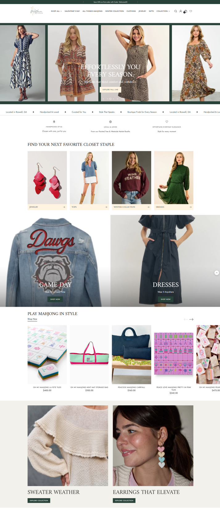
From there, we built a plan that went beyond a visual refresh. We created a new logo and brand direction, defined colors and fonts, and redesigned the Shopify site around how customers actually shop. Navigation was simplified, categories were cleaned up, and product filtering was added so users could find what they needed without friction.
 
We also optimized the site for mobile, streamlined the checkout experience, and implemented SEO best practices across product pages to ensure the site wasn’t just easier to use, but easier to find.
 
The goal was simple: turn a confusing template-based store into a clear, credible, conversion-focused brand experience.
 

Key Project Points We Focused On

This project wasn’t just a website redesign. It was about building a recognizable, cohesive brand across the website and social media, and making sure everything worked together to drive visibility and sales.
 
Brand foundation
We started by creating a custom logo and defining the visual identity, including brand colors and fonts, to give the business a clear, consistent look and feel across all platforms.
 
 
Website transformation
The Shopify site was completely restructured to simplify navigation, improve product discovery, and create a smoother shopping experience. We introduced clearer categories, product filtering, SEO optimization per product, and a simplified checkout flow to reduce friction and improve usability, especially on mobile.
 
Social media integration and brand visibility
To support brand awareness and create a more recognizable presence, we also aligned the client’s social content with the new visual direction and website experience. Here are a few examples of the content that helped grow their audience from 50 to 545 followers:
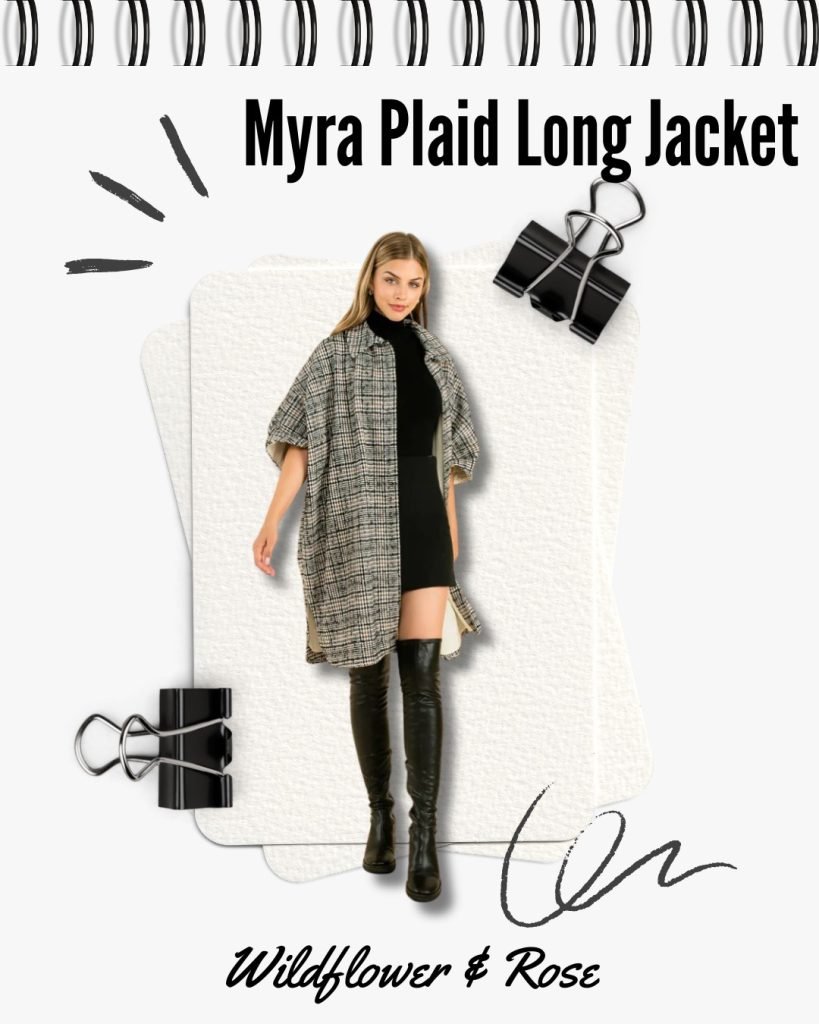
These posts reflect the updated brand look, clearer messaging, and more cohesive visual identity that now carries through from social media to the website.

Our Results

The Wildflower & Rose Shopify redesign delivered a clearer, more cohesive, and more conversion-focused e-commerce experience. The new website now reflects the brand’s personality, showcases products more effectively, and guides customers through a smoother, more intuitive shopping journey.


With simplified navigation, cleaner categories, and improved product discovery, visitors can now find what they’re looking for faster and with less friction. The updated brand identity and consistent visual system across the site also strengthened credibility, making the business feel more polished, professional, and trustworthy.


From a performance and usability standpoint, the site is now:

  • Easier to navigate, with a simplified menu and clearer product categories
  • More intuitive to shop, with improved product filtering and structure
  • Optimized for mobile, creating a smoother experience across devices
  • Better positioned for search, with SEO best practices applied to product pages
  • More conversion-focused, with a streamlined checkout flow and clearer paths to purchase

Most importantly, the website is no longer just “a place the business exists online.” It’s now a true sales and branding tool that supports growth, builds trust with new customers, and gives the owner confidence to share and promote the brand.


The end result is a Shopify store that looks more elevated, works more efficiently, and supports the long-term goals of the business by turning a cluttered, template-based site into a clear, scalable, and conversion-driven e-commerce experience.

Before & After Highlights

Let's Connect

Let’s Collaborate and Build Your Business Together

Ready to take your business to the next level? Let’s create a plan that sets you apart and drives your success.

ribbon breast cancer awareness treble clef breast cancer dribbble ampersand signature pink background ribbon banner cursive dribbble icon calligraph ribbons musical note musical symbol tied knot pink colour dribbble social icon hairpin pink color